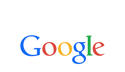
Google, after the complete reconstruction of its company’s hierarchy has come up with a completely new logo which is now public with very cute animation that shows the construction, very pleasantly. This logo seems to be in-sycn with the parent company’s Logo (Alphabet).
It might seem as a very subtle change but folks over at The Verge have a different view as they said,”But this is easily its biggest change since 1999, when Google first cleaned up the lettering and settled on its four colors. Since then, the logo has just been flattened out more and more, with today’s update representing a huge leap. In addition to changing up the wordmark, Google is also changing the tiny “g” logo that you see on browser tabs. It’s now going to be an uppercase “G” that’s striped in all four of Google’s colors. Google says that the new design will be rolling out across all of its products soon — in fact, it’s already on Google’s homepage, with a cute animation that wipes away the old logo and draws in the new one.”
Here is the new animation that will be seen on all google services soon.
Source: TheVerge